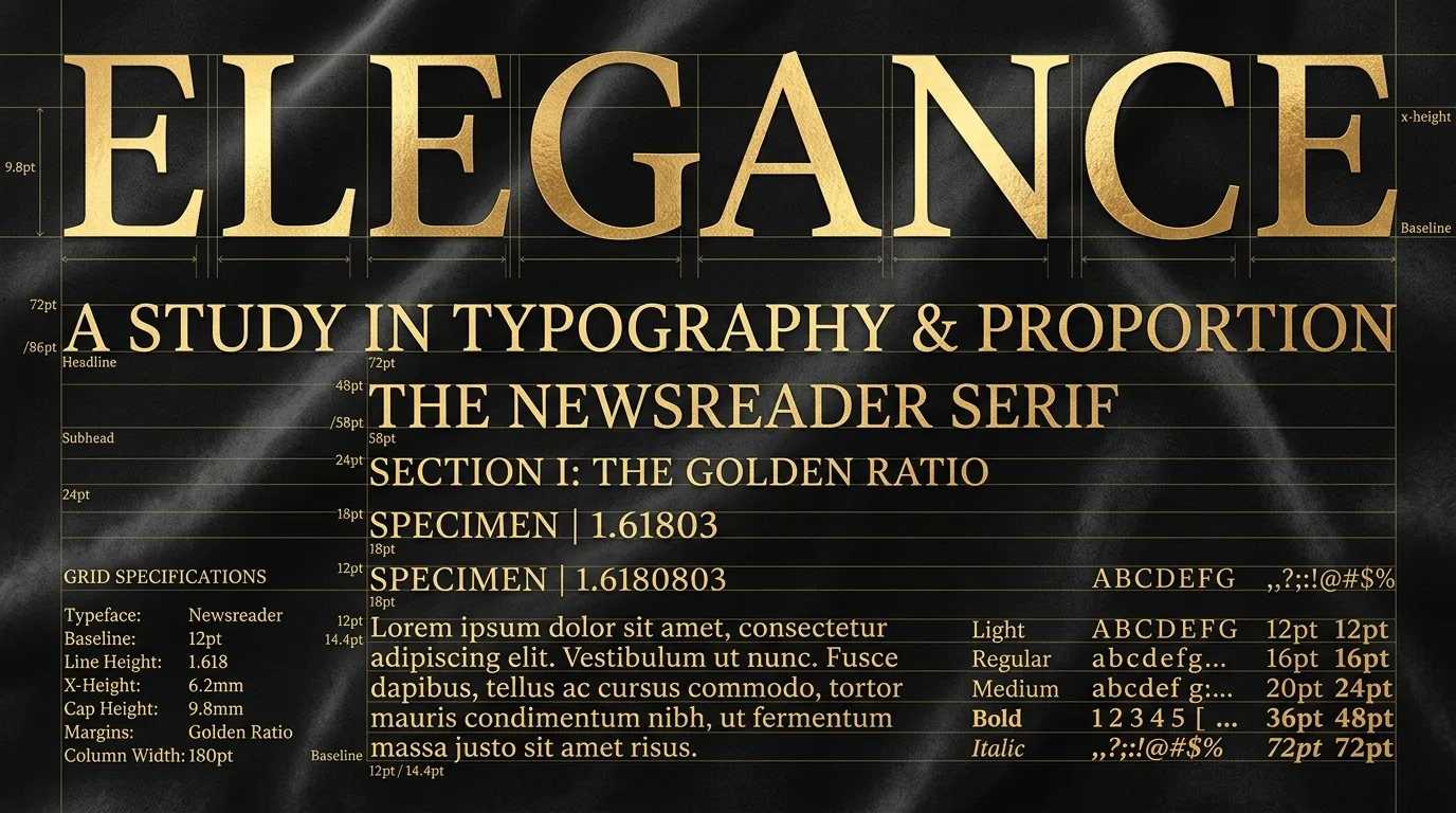
Typography is not merely how text looks; it is the physical voice of your brand when you are not in the room.
In an era saturated with interchangeable SaaS templates styled with generic system fonts, masterfully set editorial typography immediately signals prestige, intellectual gravity, and uncompromising craft.
The Power of the High-Contrast Serif
At Studio Ravya, we pair Newsreader - a transitional serif designed for long-form readability with optical sizing (opsz) - with Plus Jakarta Sans, a geometric neo-grotesque.
Why does this pairing work?
- Newsreader brings warm, literary authority to display headlines, evoking the heritage of fine architectural monographs and high-craft editorial journals.
- Plus Jakarta Sans brings razor-sharp clarity, legible numerical tabular figures, and modern UI cleanliness to buttons, tags, and data tables.
/* Fluid Editorial Headline Clamp */
h1 {
  font-family: 'Newsreader', Georgia, serif;
  font-size: clamp(2.5rem, 5vw + 1rem, 4.25rem);
  line-height: 1.12;
  letter-spacing: -0.02em;
  font-weight: 400;
}
The Golden Ratio Baseline Grid
Visual discomfort in web reading rarely comes from the typeface itself; it stems from inconsistent vertical rhythm.
- Set line height (
line-height) relative to measure (characters per line). For 65–75 characters per line,1.65to1.75line height allows the eye to effortlessly sweep back to the next line without losing place. - Use generous paragraph spacing (
margin-bottom: 1.75rem) to let high-density conceptual paragraphs breathe.
When words are treated as architectural elements, reading becomes an immersive sensory pleasure.